
Liang Dian Design Center
A meeting point between Scandinavian design and Chinese culture.
Liang Dian Design Center
A visual identity for a contemporary design hub and gallery space in Beijing, created to connect European and Chinese design perspectives through a clear and distinctive graphic language.
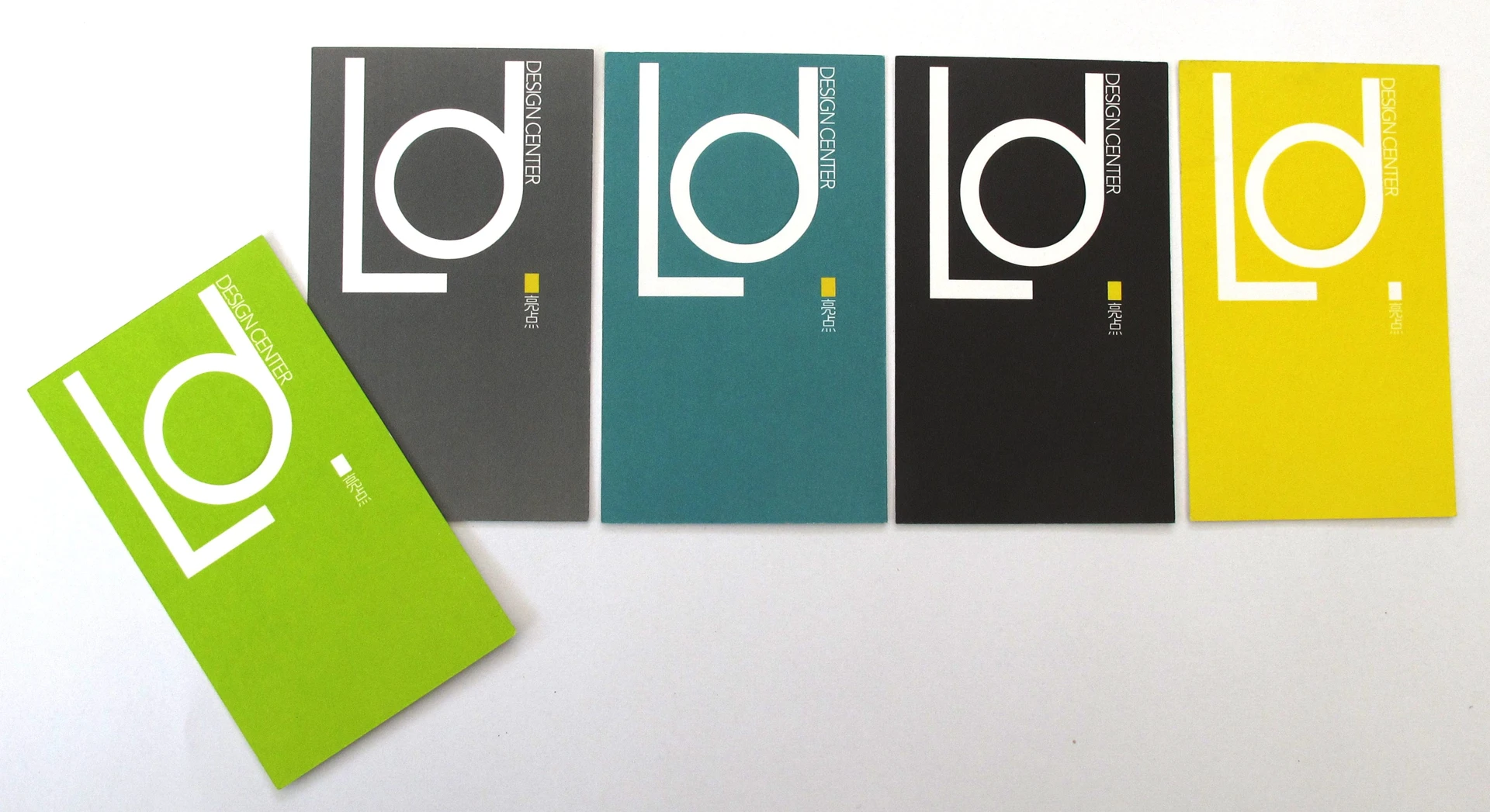
The Brief
Creating a shared identity for two design cultures.
Develop a branding and identity package for a Chinese design hub and gallery space, communicating to both European and Chinese audiences.
The ambition was to create an identity inspired by Scandinavian design while remaining relevant to the local cultural context.
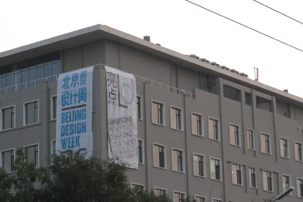
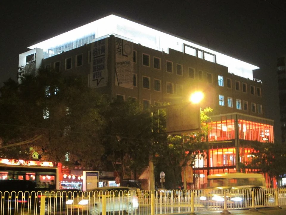
The Thinking
Finding clarity across cultures.
We explored how the principles of Scandinavian design, clarity, simplicity and structure, could inform a visual language rooted in a Chinese context.
A central part of the challenge was the relationship between the Latin alphabet and Mandarin characters.
Rather than treating the two as separate visual systems, we explored an organised and graphic approach that could bring them together in a coherent identity.
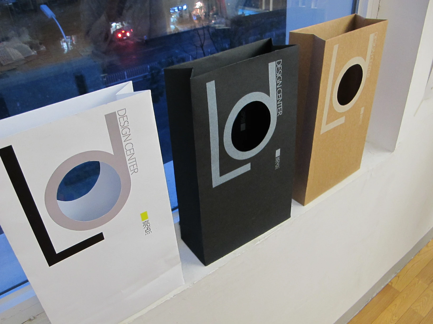

The Identity
A structured language with room for diversity.
The identity was built around a clear graphic system inspired by Scandinavian visual principles and adapted to the Mandarin language.
A distinctive colour system created visual divisions between the different in-house members, galleries and spaces within the design centre.
This gave the hub a flexible identity that could organise multiple creative voices while maintaining a recognisable overall expression.


Project Details
- Client
- Liang Dian Design Center
- Location
- Beijing, China
- Context
- Design hub and gallery space
- Audience
- Chinese and European clientele
- Scope
- Branding & Visual Identity
- Key elements
- Graphic language, colour system and bilingual visual communication
Services
- Brand Strategy
- Brand Identity
- Creative Direction
- Graphic Design
- Typography & Visual Systems
- Brand Applications
Different perspectives. One shared visual language.
We help organisations translate their ambitions into distinctive identities that connect people, cultures and ideas.